Digital Muse Creative Brand Identity
Digital Muse Creative is an up-and-coming design studio that aims to reconnect us with our deep historical, literary, and cultural heritage from across the eons.
The studio applies timeless imagery in new and exciting ways, specializing in using these principles for branding, websites, product design, UX, ad creative, and much more.

Greco-Roman Branding for Design Studio
A stylized, modern Greco-Roman brand identity for a newly-minted design studio and creative consultancy.Lead Designer
Creative
4 Weeks
Mythology as a Stylistic Reference
The intent behind the design was to essentially anthropomorphize the very idea of creative inspiration by alluding to some of the historical, artistic, and mythological references that Digital Muse Creative is known for.
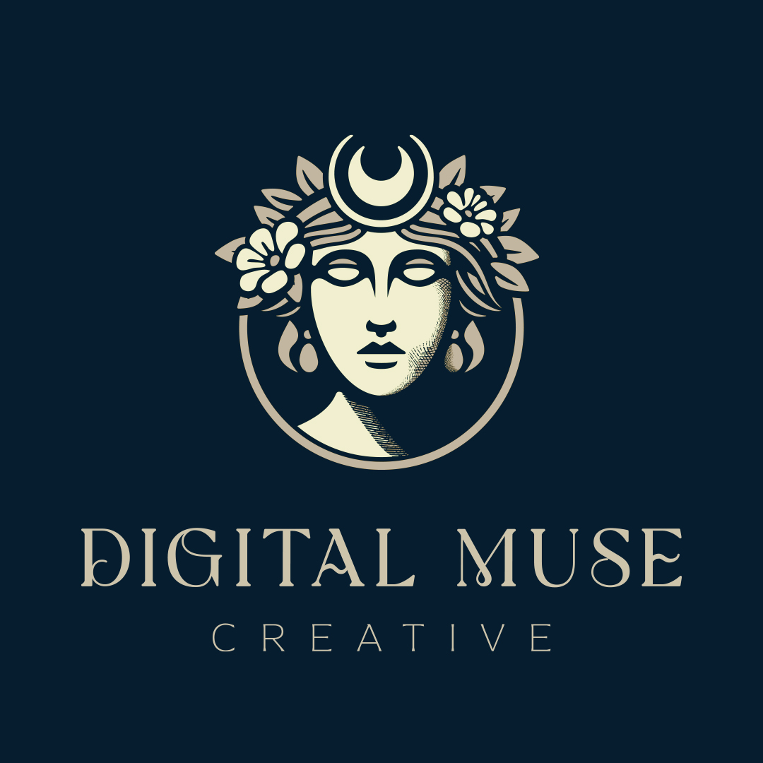
One of the primary visual inspirations was the Aphrodite of Melos, also known as Venus de Milo (below). Aphrodite is the Greek goddess of beauty, love, procreation, and passion, symbolizing the journey by which ideas grow and turn into visual creations.
“She spoke and loosened from her bosom the embroidered girdle of many colors into which all her allurements were fashioned. In it was love and in it desire and in it blandishing persuasion which steals the mind even of the wise.”


Gods & Symbols
Digital Muse Creative aims to transform historical and literary imagery for 21st-century audiences. In developing the final concept, the design delved deeper into mythology and ancient symbology, incorporating elements such as:
Verbena
Commonly symbolizes creative inspiration
Selene
Greek goddess of the moon, symbolizing dreams, growth, and renewal, represented by symbols like the crescent moon and cloak
Knowledge
Symbol commonly appears in Greek art as a symbol for knowledge
Design Process

Early Design Concepts
One of the first concepts featured a mysterious hooded/cloaked figure, which caught the client’s eye.
However, it was felt that this version leaned too heavily into “Digital” and not enough into “Muse” and “Creative.”

Shortly thereafter, we landed on an early-20th-century/Art Nouveau-esque vibe, which ultimately informed the direction in which the typography went.
This feedback was instrumental to finding a solution for the final design.
Typography
A contemporary take on Art Nouveau typography was chosen for its exaggerated ligatures, which brought a sense of movement and ethereality to the logotype. This style blended historical elegance with modern creativity, perfectly encapsulating the brand’s essence.
As a base, the font Asterina—made by Creative Fabrica—was chosen and thoughtfully modified to match the Nouveau aesthetic.

Final Designs
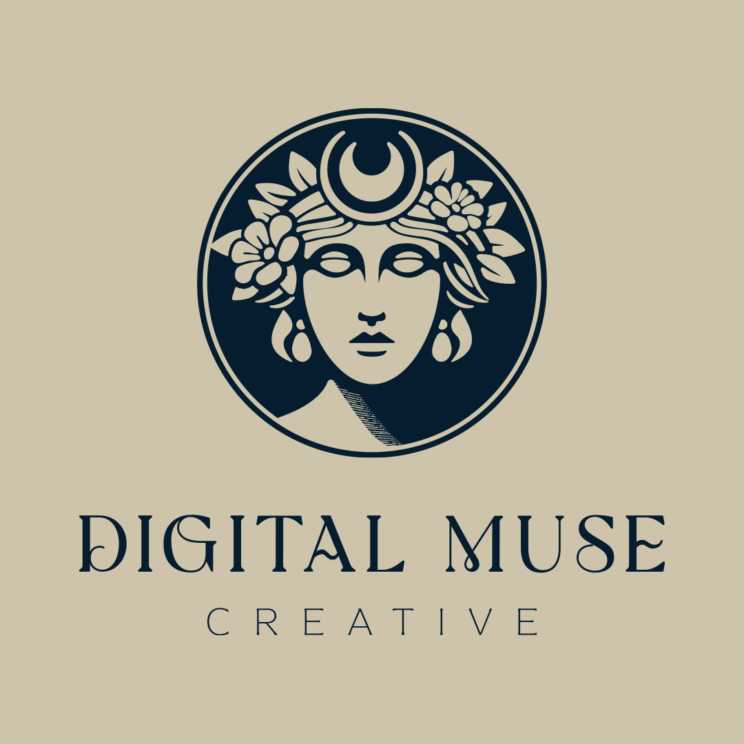
The final design for Digital Muse Creative successfully merges historical and cultural references with contemporary design elements. By drawing inspiration from mythology and ancient symbols, the brand identity feels both timeless and relevant. The typography and visual motifs create a cohesive and memorable identity that stands out in the design studio landscape.
Closing Reflections
Digital Muse Creative’s brand identity is a testament to the power of historical and cultural references in modern design.
Through careful research and creative application, the brand tells a story that is both rich in heritage and forward-looking, connecting audiences to the timeless process of artistic inspiration.