Web Design

PALISADE Social Anxiety Clinical Trials

Through the partnership between Alan + Co. and Vistagen, I designed and built a responsive, well-planned website and lead-generation funnel.

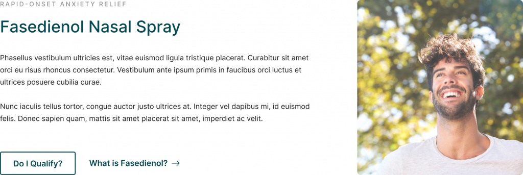
The goal for the website is to educate the public about novel drug fasedienol, proposed as a rapid-relief treatment for Social Anxiety Disorder (SAD).

PALISADE Social Anxiety Clinical Trials | Designed by Dane O'Leary Media
Project

Medical Research Website to Attract Investors & Clinical Trial Participants

Designed and built a website for the PALISADE Clinical Trials, establishing a digital HQ with which to attract clinical participants as well as potential investors.
Details
Role

Lead Designer

Industry

Medical, Biotech

Timeline

6 Weeks

Overview

Designing a Dual-Purpose Website for Fasedienol Clinical Trials

The PALISADE Clinical Trials are at the forefront of testing Fasedienol, a novel nasal spray aimed at providing rapid relief for social anxiety. The website for PALISADE needed to effectively serve two distinct audiences: potential trial participants and investors. It also required a functional pre-clinical qualification screener to streamline participant intake.

This case study outlines the design and development process, challenges faced, and solutions implemented to ensure the website meets the goals of engagement, credibility, and usability.

Discovery & Research

Before diving into design, I undertook comprehensive research to understand the key needs of both user groups:

Participants

Their primary concern is understanding the trial process, safety, and efficacy of the drug. They need clear, accessible information and an easy way to determine eligibility for the study.

Investors

Investors seek scientific credibility, potential market size, and a streamlined explanation of the clinical trial stages. They value professional presentation and easy access to in-depth, data-driven content.

I conducted interviews with stakeholders from PALISADE, reviewed competitor websites, and analyzed user personas to ensure the final product would effectively appeal to both groups. This was crucial in shaping the content structure, user flow, and tone of the website.

PALISADE Clinical Trials mood board 1 | Dane O'Leary Media
PALISADE Clinical Trials mood board 2 | Dane O'Leary Media
Visual Exploration

Mood Boards

The mood boards established the initial visual direction for the PALISADE Clinical Trials website, focusing on creating a balance between clinical credibility and approachability. The target audience consisted of two distinct groups: potential trial participants and investors, each requiring tailored design considerations.
For participants, the goal was to create a sense of trust and ease, using calming colors, relatable imagery, and a clean, intuitive layout. For investors, we wanted to maintain a polished, data-driven aesthetic that highlights the scientific credibility of the trial, appealing to those seeking financial opportunities in the healthcare sector.
The mood boards incorporated a mix of soothing blues and greens, soft gradients, and a modern font selection, all of which are reflected in the final design. By aligning the visual components with the needs of these audiences, we were able to ensure that both user groups could navigate the site easily and access the information most relevant to them.

Visual Direction

Colors & Branding
The color palette, featuring shades of blue, gray, and green, immediately conveys a sense of professionalism, reliability, and calm. These colors are commonly associated with healthcare and scientific advancement, which is ideal for building trust with both potential participants and investors.
The incorporation of the PALISADE logo (top-right corner) emphasizes brand identity, and the balance between clean whites and soft gradients creates an inviting and modern look.
Typography
For the website, we chose Inter as the primary typeface. Inter is a versatile and highly readable font that works well for display, body, and call-to-action copy. In every context, it maintains a sense of professionalism without feeling too rigid or intimidating, crucial for a website that needs to engage participants with social anxiety while also appealing to potential investors.
Since Inter is optimized for digital interfaces, its readability on screens—especially on different devices and resolutions—is superb for ensuring that the website remains accessible across various devices.
Layout & UI Components
The use of modular grids and large white spaces keeps the website easy to navigate, allowing users to focus on specific calls to action without being overwhelmed. This layout helps in ensuring a seamless flow whether someone is seeking information on the clinical trials or the investment opportunities.
Design Execution

Creating the Homepage Design

The design of the PALISADE Clinical Trials website emphasizes accessibility, trust, and user engagement, focusing on two primary pages: the homepage and the preclinical assessment/screener page. Both designs leverage a clean, modern layout that caters to two distinct audiences—trial participants and investors—while ensuring that the user journey is clear, intuitive, and non-intimidating.
Homepage Visual Hierarchy
The homepage design prioritizes visual hierarchy to guide users through key actions. The headline “New Hope for Those With Social Anxiety” is the first element users see, positioned prominently to establish the purpose of the clinical trial and its innovative treatment.
Typography
The use of Inter in bold for the headline emphasizes importance, while regular and medium weights are applied to body text to improve readability and content hierarchy. By maintaining this distinction, users can easily differentiate between primary actions and supporting information.
Calls-to-Action (CTAs)
The buttons, “Do I Qualify?” and “About the Study,” are designed with large, clickable areas to enhance the clickability and discoverability of key actions. These prominent CTAs are strategically placed in both the hero section and repeated further down the page, ensuring they are always within easy reach, adhering to the principle of affordance.
Homepage design for PALISADES Clinical Trials, website design | Dane O'Leary Media
Informative Content Blocks
Sections like “Fasedienol Nasal Spray” and “Criteria for Participating” answer key user questions early, utilizing concise, straightforward language and digestible content chunks. Breaking content into smaller pieces ensures users quickly understand the trial’s purpose and their eligibility.
Fasedienol nasal spray content block | Dane O'Leary Media
Optimized User Flow & Content
The homepage is structured around a scannable design, helping users to navigate quickly. The dual pathways—one for potential trial participants and one for investors—are clearly delineated through CTAs and content sections. This segmentation reduces cognitive load, as users are able to identify the content most relevant to them at a glance.
Responsive Design
The layout ensures that the site adapts well across devices. Each element—images, text, and buttons—scales appropriately, ensuring a seamless experience whether users are on desktop or mobile.
Empathetic & Inclusive Imagery
The imagery used in the homepage reflects diversity, showing real people who appear relaxed and engaged. This fosters a sense of inclusion and empathy, crucial for participants dealing with social anxiety. The emotional design aspect here is aimed at reducing user apprehension and increasing connection to the trial’s mission.
Effective Use of White Space
White space is used generously to separate sections and elements, which creates a visual breathing room and improves focus on the content. This minimalist approach reduces distractions, guiding the user’s attention to critical elements such as the CTAs and key messaging.
Design Execution

Creating the Preclinical Screener

The preclinical assessment page uses progressive disclosure—a design pattern where information is revealed incrementally. This keeps the screener simple and prevents users from feeling overwhelmed by presenting one question at a time. This design decision reduces user cognitive load, ensuring the process feels manageable and accessible, especially for users who may experience social anxiety.
Microinteractions
The “Next” button provides feedback when clicked, reinforcing a sense of progression. Microinteractions like these enhance the overall experience by offering subtle confirmation that the user is moving forward in the process, adhering to the UX principle of feedback.
Preclinical screener design | Dane O'Leary Media
Screener page design for PALISADES Clinical Trials, website design | Dane O'Leary Media
Engaging & Supportive UI Elements
The screener questions use large, tappable radio buttons for easy selection, particularly on mobile devices. This satisfies mobile-first design principles and ensures accessibility across devices, a critical component given that a large portion of users may access the site via smartphones.
The screener form follows best practices in form UX by using a single-column layout, reducing the effort required to complete it. This format ensures that users can easily follow the progression from question to question without confusion.
Progress & Completion
Step-by-Step Navigation
The addition of back/next buttons offers users control over their journey, allowing them to revisit questions if needed. This enhances user autonomy and reduces anxiety around making mistakes during the screening process.
Progress Indicator
Although a numerical indicator was used for the concept, a progress bar could be considered in future iterations to visually communicate how far along the user is in the screener process.
Informative Supporting Sections
The lower half of the page offers educational content, such as “Learn About Social Anxiety & the PALISADE Mission”. This section provides users with additional context about the trial and disorder, encouraging engagement for those who may need more information before completing the screener.
Linking to FAQs
Users who need further clarification can easily access the FAQ section through a prominent button. This keeps all necessary resources within reach, adhering to the proximity principle in UX.