Web Design

Seasonal Depression Clinical Trials Website & Lead-Generation System

In collaboration with Alan + Co., I designed and developed a responsive, purpose-driven website and lead-generation funnel for a clinical trial initiative.

The objective of the website was to inform the public about a novel investigational treatment for Seasonal Affective Disorder (SAD) and support lead generation for potential trial participants and investors.

Seasonal Depression Clinical Trials website mockup | Dane O'Leary Media
Project

Web Design for Medical Research: Investor & Participant Recruitment Funnel

Designed and developed a website for Seasonal Depression Clinical Trials, a client looking for a digital hub to engage clinical trial participants and potential investors.
Details
Role

Project Lead/Principle

Industry

Mental Health

Timeline

6 weeks

Toolkit
Figma.logoCreated using Figma
Disclaimer

Due to a non-disclosure agreement (NDA), certain details in this case study—like the client’s branding and specific area of treatment—have been modified to anonymize the project. The design approach, strategy, and process, however, reflect the actual work completed for this project.

Overview

Designing a Dual-Purpose Website for Seasonal Depression Clinical Trials

Seasonal Depression Clinical Trials is a pioneering initiative exploring a new, rapid-relief treatment for Seasonal Depression. The website needed to address two key user groups: potential participants interested in the clinical trial and investors. The site also required a pre-screening feature to streamline participant intake.

This case study outlines the design and development process, challenges encountered, and solutions implemented to ensure that the website effectively met goals related to engagement, credibility, and usability.

Discovery & Research

I conducted in-depth research to understand the unique needs of both target audiences:

Participants

They needed clarity on the trial process, safety, and potential benefits. Accessibility and a straightforward qualification assessment were essential.

Investors

Investors sought scientific credibility, insight into the market opportunity, and a clear breakdown of the clinical trial phases, favoring a professional presentation and data-rich content.

Preproduction + Design

Mood Boards

The initial mood boards guided the visual direction of the Seasonal Depression Clinical Trials website. For participants, the goal was to create a welcoming and reassuring experience, utilizing calming colors and a simple, intuitive layout. For investors, the focus was on a refined, professional aesthetic that would highlight the credibility and potential impact of the trial.
The color palette featured soft blues and greens, and typography was chosen for clarity and approachability. These visual elements were carefully balanced to ensure both audiences could easily access relevant information and navigate the site seamlessly.
Seasonal Depression Clinical Trials mood board 1 | Dane O'Leary Media
Seasonal Depression Clinical Trials mood board 2 | Dane O'Leary Media

Visual Direction

Colors & Branding
The palette of blues, greens, and grays conveys professionalism and calm, establishing trust with participants and credibility with investors. Shades of gold tie everything together with an air of optimism and positivity.
Typography
Inter was selected as it's a typeface created for maximum readability and versatility. In fact, Inter is known to work well for digital interfaces, maintaining legibility across devices.
Layout & UI Components
Using modular grids and generous white space, the design ensures that the site is easy to navigate, allowing users to focus on key actions and information without being overwhelmed.
Preproduction + Design

Wireframes

To meet the client's goals for the Seasonal Depression Clinical Trials website, I developed wireframes that structured complex information and incorporated a location search feature for easy access.

Visual Direction

Data Organization & Hierarchy
The FAQ page—ultimately removed from the project plan although I was, in fact, able to repurpose this accordion component—needed to provide clear, organized answers to complex questions. The collapsible layout minimized risk for information overload by ensuring a clean, user-friendly experience.
Location Search
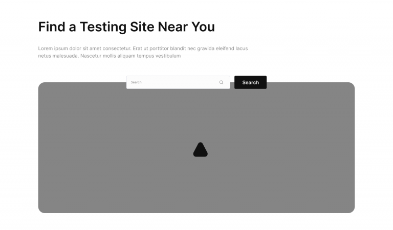
While there are a number of components I designed for the project, the search functionality component was arguably most important. It had to give users the ability to quickly locate nearby testing sites without needing to navigate through lots of other pages.
production + Design

Homepage

The design for the Seasonal Depression Clinical Trials website was crafted to foster accessibility, trust, and engagement. The Homepage and Preclinical Screener, as core elements of the site, were designed to address the needs of two primary user groups—potential participants and investors—while guiding each through a clear and intuitive user journey.
Homepage
Building Trust & Connection
The Homepage layout balances approachable, empathetic imagery with concise, informative content blocks to help communicate the trial’s purpose and key benefits without users feeling overwhelmed.
Introducing clinical trials
This section provides an overview of the study, outlining eligibility criteria and emphasizing the support available for participants. By presenting critical information in digestible chunks, the design helps users find relevant details quickly and confidently.
Participant info & CTA blocks
Throughout the Homepage, clear calls-to-action such as “Learn More About the Trial” and “Do I Qualify?” guide users to take the next steps. These CTAs, strategically positioned and repeated along the page, are designed for easy accessibility, ensuring they remain visible as users scroll.
Visual & emotional hierarchy
I applied a combination of bold headings, subtle color gradients, and relatable, diverse imagery to convey empathy and credibility. A palette of soothing greens and warm accents was meant to enhance the supportive tone and appeal to those experiencing depression.
Homepage design for Seasonal Depression Clinical Trials, website design | Dane O'Leary Media
Screener design for Seasonal Depression Clinical Trials, website design | Dane O'Leary Media
production + Design

Preclinical Screener

The Preclinical Screener was an essential component to help users determine their eligibility quickly and simply. The screener follows a straightforward Q&A format with progressive disclosure to minimize cognitive load and keep the process manageable.
Mobile-first accessibility
Recognizing that many users may access the site on mobile, the screener’s layout is optimized for smaller screens.
Supportive messaging
The screener uses approachable, supportive language and extends the offer to learn more about the clinical trial if users need additional context.
Clear visual feedback
Microinteractions—like when a button changes color or moves on its Y-axis when you hover your cursor over it—give users the of instant feedback that resembles real-world interactions, which creates a sense of progression while reassuring users that they’re making progress. Encouraged by the interactivity, the microinteractions make them more likely to complete the screener.
Production + Development

Technical Implementation

The Seasonal Depression Clinical Trials website was developed with a focus on performance, scalability, and having the ability to quickly develop and implement custom features.
WordPress & Bricks Builder
Bricks Builder was selected as the primary page builder within WordPress due to its flexibility and similarities to Figma, which made translating design components into responsive web elements much more streamlined. This also helped to align the website’s final look and functionality across device types.
Custom Screener with Location-Based Search
The preclinical screener involved a custom-coded solution to meet the client’s requirement for an intuitive, location-based search feature, optimized for ease of use and accuracy.
Leveraging Session Cache

To enhance performance and provide a seamless experience, all potential clinical trial locations are locally. This ensured that the site could avoid excessive server requests that would slow things down and deplete server resources.

GPS + Zip Code Search

Users can choose to provide location via GPS or manually by entering a zip code. The system then uses JavaScript to find trial locations within a 150-mile radius of the detected or entered location.

Referring Session to Third-Party Platform

After selecting a location, the session is handed off to a third-party platform to collect further information and continue the qualification process. I made sure that we met both usability and data-handling requirements as well.

Combining the WordPress ecosystem with custom JavaScript for the location-based screener, the website balances maintainability and performance, delivering a user-friendly interface aligned with the needs of both trial participants and the research team.
See More Projects