Hi, I'm Dane 👋🏼
I’m a multidisciplinary UX designer specializing in scalable design systems, accessible UI design, and a passion for building scalable systems and meaningful, outcomes-focused digital experiences. I help brands, products, and teams bridge the gap between engaging visuals and tangible impact.
No fluff. No ego. Just clear thinking, crafted outcomes, and honest conversation.


Transforming ideas into experiences.
Over my time in the design industry, I have successfully completed numerous projects that span branding, web design, and UX. Each project reflects my commitment to quality and client satisfaction.
Years of UX, web & brand design
Projects completed (98% on-time delivery, 36mo.)
Users activated

"Dane drives the creative process with impactful solutions and unique strategies, and has a vision for details while hitting key deadlines and managing multiple projects at once."

My design specialties.
Clients enjoy working with me because I have a keen eye for detail, a passion for creative problem-solving, and offer them a one-stop-shop for all of their brand-focused web and product/UX design projects.
Building dynamic, scalable brand systems
My brand systems flex across touchpoints—digital, physical, and experiential—balancing consistency with adaptability and helping brands evolve without losing cohesion. This requires clarity, hierarchy, and tools that enable more smooth, seamless scaling.
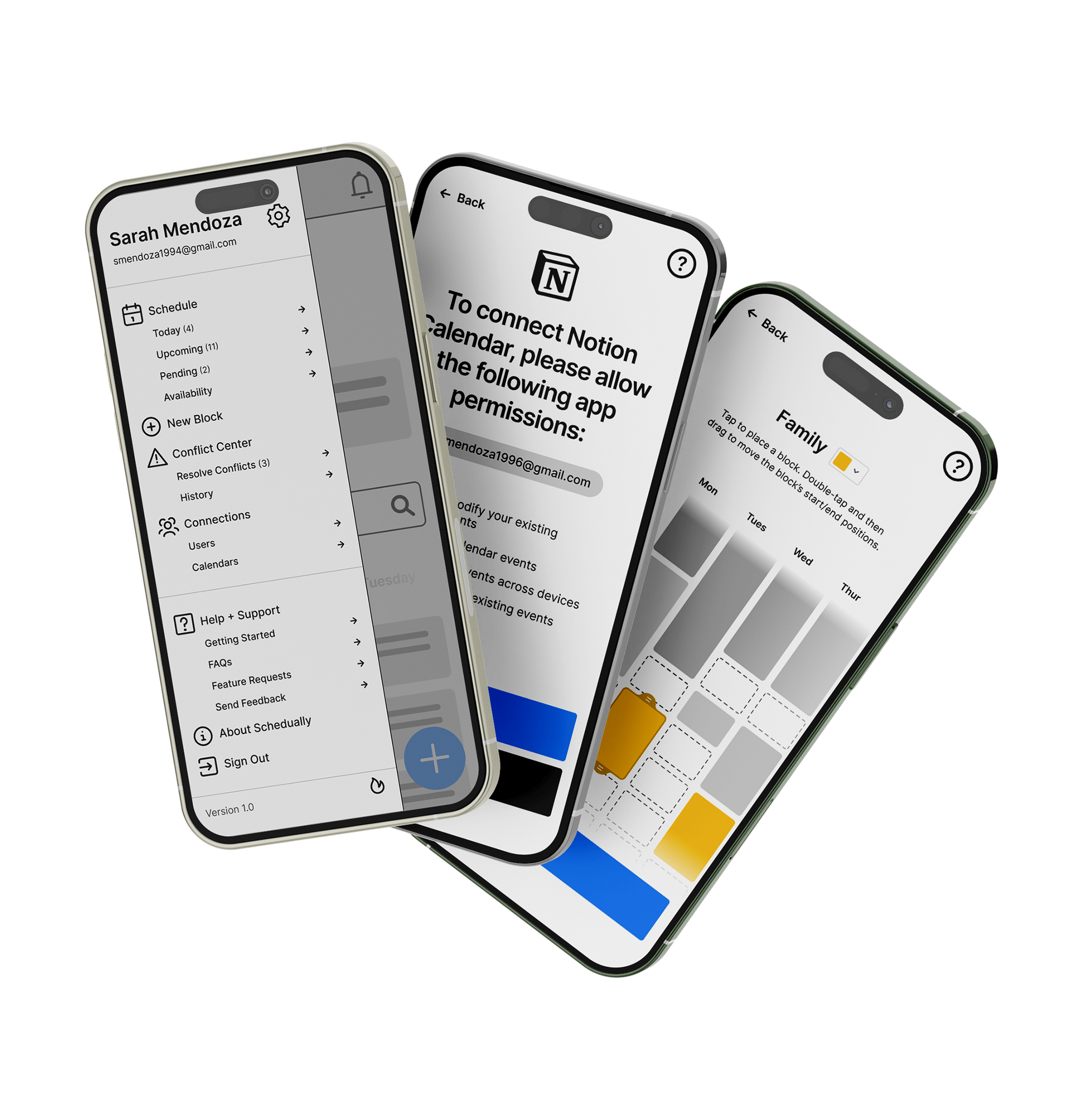
Responsive, accessible web design
I’ve shipped high-performance websites using Webflow, Framer, and WordPress, building interfaces that balance aesthetics with usability and accessibility. Every decision—from typography to transition timing—is made in service of a seamless user experience.
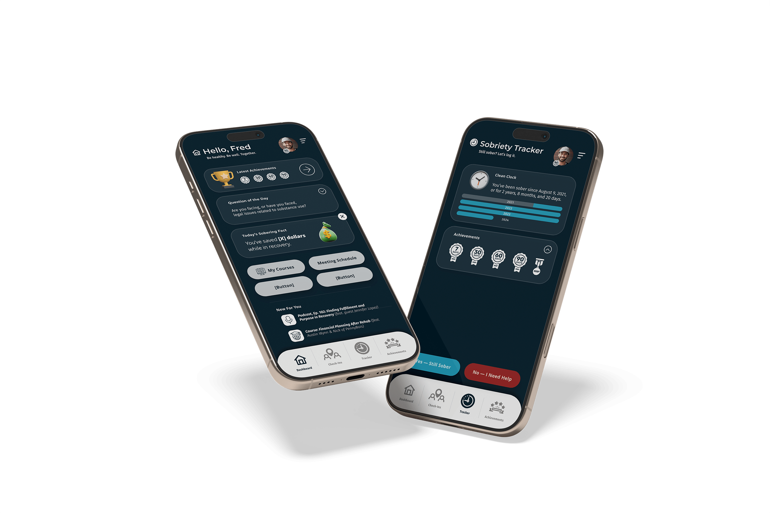
Data-informed UI design for real-world impact
As millions of failed products have shown, great interfaces don't just happen. Fortunately, I design user experiences backed by behavioral insights, conversion data, and usability heuristics, blending intuition with evidence to ensure every element serves a clear purpose.
Let's Connect
Interested in scheduling a 1:1 mentorship with me?
I offer a variety of coaching and mentoring options, from portfolio reviews to interview prep. At zero cost.
Secure a slot on my schedule now.
