Flipping the Funnel: How Location-First Design Cut Clinical Trial Abandonment 29%

Problem
Outcome
Launching a Trusted Digital Experience for a New Clinical Program
Clinical trial recruitment operates in a uniquely challenging space: convincing healthy skeptics to volunteer for medical research requires extraordinary trust-building and transparency. The SAD (Seasonal Affective Disorder) clinical trial faced this universal challenge amplified by seasonal timing—recruitment needed to happen during winter months when potential participants are statistically more likely to be experiencing depressive symptoms.
The Problem
The client, an established Fortune 100 clinical research organization, approached us after data from the four previous campaigns surfaced a persistent problem: 65% average pre-screening abandonment. They were satisfied with the prior team's technical execution, but their hope was for a different team delivering better results. Users would begin the eligibility screener but bail halfway through, creating a recruitment bottleneck that undermined campaign spend and delayed enrollment timelines.
The study required recruiting across multiple geographic locations. The client initially requested another site following the flow as previous sites: informational content about the study → medical details → pre-screening form → test site information. This approach mirrored industry convention and had been executed competently before. But high task abandonment pointed to a substantial bottleneck.
Historical Performance Issues
Analysis of the client's internal data from four previous clinical trial websites revealed a consistent pattern:
- 65% average form abandonment halfway through pre-screening across all four trials
- Users spent significant time reading about the trial (avg 3:12 on informational pages) but abandoned once they hit the screener
- Location information was conversion-walled: only revealed after screener completion as part of "next steps"
- Support emails consistently asked "Can you tell me if there are test sites near me?" even though location selection was technically already part of the user flow (albeit buried post-screener)
- No clear data on why users abandoned—just that they did, consistently, at the same funnel stage
Challenges & Limitations
- Trust and privacy: users needed early proof of legitimacy and data security
- Accessibility: required full WCAG 2.1 AA compliance
- Speed: only six weeks to design, build, and launch before winter enrollment
Goals
- Design and launch the new website within six weeks.
- Increase task success rate (i.e. screener completions).
- Ensure HIPAA-compliant, ADA-accessible participant experience.
- Integrate React-based eligibility screener with backend enrollment systems (Miracle Software).
My Role
As the sole UX/UI designer, I led discovery, information architecture, UX flow, and visual design. I partnered with a front-end developer to execute the screening tool using HTML + CSS + React + JS, ensuring performance, validation accuracy, and accessibility at scale.


Behavioral Research & Funnel Strategy
With only six weeks to design, build, and launch before winter enrollment season, I couldn't afford exploratory research that didn't directly inform architecture decisions. The strategy centered on answering one question: What makes potential participants feel confident enough to begin a medical application online—and what causes them to abandon it?
The client's four previous trials provided quantitative proof of failure (65% abandonment), but no insight into why users left. The previous team had delivered technically sound sites following industry best practices—the problem wasn't execution quality, it was structural. I needed to understand the psychological barriers preventing completion, then design around them.
This wasn't about criticizing prior work. It was about testing a hypothesis: Maybe the industry-standard template itself created friction, regardless of how well it was implemented. If location uncertainty was driving abandonment, no amount of visual polish or technical optimization would fix it. The funnel sequence needed to change.
The process unfolded in two phases:
- Behavioral Research & Insight Discovery
- Conversion-Focused Design and Testing
Discovering the Location Barrier
On my request, the client put me in contact with 8 test users (ages 24-61) who had worked with the previous team on the last four campaigns. I also audited several other clinical trial recruitment sites—both academic and private sector—looking for common patterns in how they structured information and screened participants.
Each participant scrolled looking for location information before engaging with the screener. When they couldn't find it, they begrudgingly started the form with visible hesitation. One participant articulated it directly: "I see no point in divulging my medical history if this trial is in California and I'm in Ohio."
Methods
- 8 remote interviews with prospective participants (ages 24–61)
- 5 competitive audits of existing clinical trial websites (academic + private)
- Benchmark comparison against similar research programs from the same company
- 3 stakeholder sessions with the recruitment/coordination leads and compliance officers
The competitive audit—including the client's previous sites—revealed why: Location information was hidden until after screener completion. This became a bottleneck as users avoided potentially "wasting" their time without knowing if viable locations existed.
Stakeholder sessions revealed two rationales:
- Concern about "discouraging" users by showing limited locations upfront—somewhat misleading since additional test sites would be added over time, allowing coordinators to reconnect with prequalified users initially outside of test site radii.
- Fear that test sites would be bombarded with questions. These dosing facilities would simply be following their protocol instructions and lack insight into eligibility criteria or enrollment status. The client was adamant that facilities not become first points of contact.
This concern was legitimate, but the solution was wrong. Hiding all location information to protect test sites from inquiries also hid basic geographic viability—the "Is this near me?" question that had nothing to do with contacting facilities directly. The 65% abandonment rate across four sites suggested this wasn't a fluke or execution issue—it was systematic friction caused by the underlying structure.
Research Insights
- Cognitive fatigue: Users were unwilling to provide personal health data without clear eligibility context first
- Trust deficit: Sites lacked upfront privacy details, no clear HIPAA messaging, sparse legitimacy signals
- Mobile readability: Previous trial sites averaged 14px body text and tight line-height—exhausting to read on small screens where 67% of traffic was coming from
- Progress ambiguity: Users couldn't estimate screener length or how much effort remained
The strategic decision: Flip the funnel by showing location upfront to confirm viability before completing the screener. While this would seem to contradict the client's request and industry convention, I found a way forward with an alternate trust-building mechanism.
Heading 1
Heading 2
Heading 3
Heading 4
Heading 5
Heading 6
Lorem ipsum dolor sit amet, consectetur adipiscing elit, sed do eiusmod tempor incididunt ut labore et dolore magna aliqua. Ut enim ad minim veniam, quis nostrud exercitation ullamco laboris nisi ut aliquip ex ea commodo consequat. Duis aute irure dolor in reprehenderit in voluptate velit esse cillum dolore eu fugiat nulla pariatur.
Block quote
Ordered list
- Item 1
- Item 2
- Item 3
Unordered list
- Item A
- Item B
- Item C
Bold text
Emphasis
Superscript
Subscript
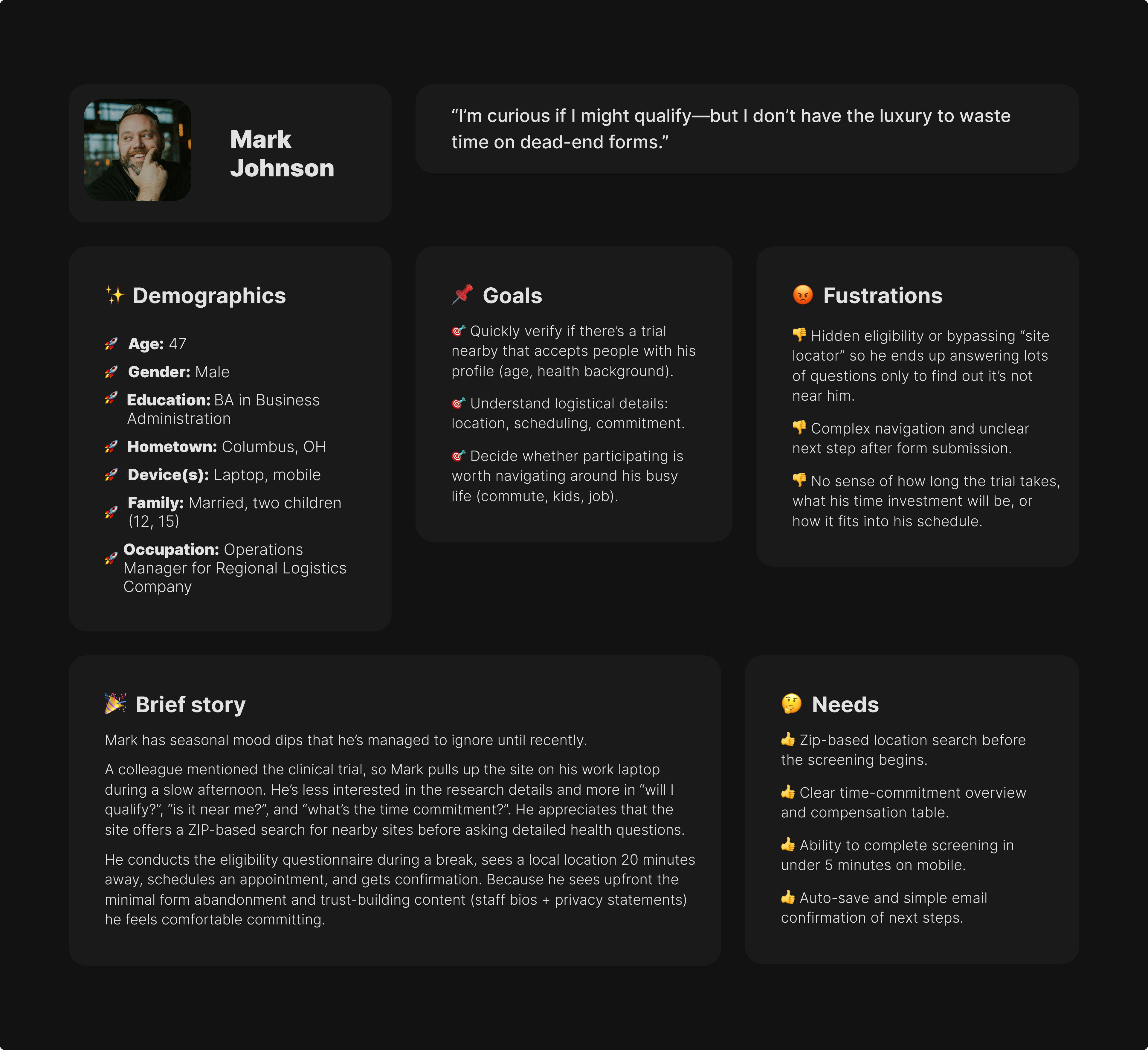
- Zip-based location search before the screening begins.
- Clear time-commitment overview and compensation table.
- Ability to complete screening in under 5 minutes on mobile.
- Auto-save and simple email confirmation of next steps.
Heading 1
Heading 2
Heading 3
Heading 4
Heading 5
Heading 6
Lorem ipsum dolor sit amet, consectetur adipiscing elit, sed do eiusmod tempor incididunt ut labore et dolore magna aliqua. Ut enim ad minim veniam, quis nostrud exercitation ullamco laboris nisi ut aliquip ex ea commodo consequat. Duis aute irure dolor in reprehenderit in voluptate velit esse cillum dolore eu fugiat nulla pariatur.
Block quote
Ordered list
- Item 1
- Item 2
- Item 3
Unordered list
- Item A
- Item B
- Item C
Bold text
Emphasis
Superscript
Subscript
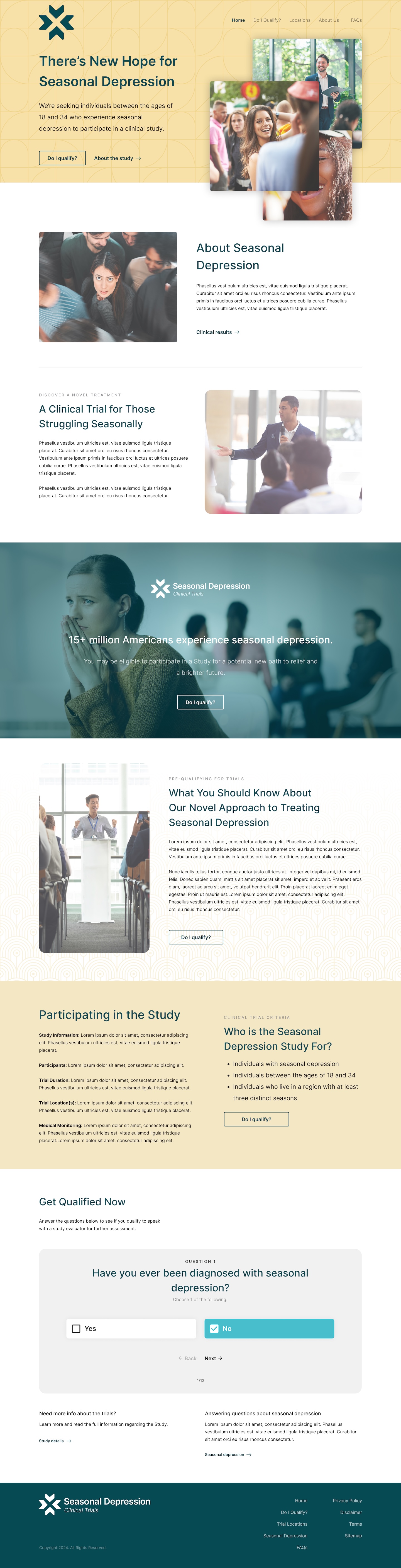
- Transparent, easy-to-read overview of the study and its benefits.
- Short mobile-friendly pre-screen that shows nearby sites early.
- Clear explanation of privacy, data use, and follow-up process.
- Digital estimates and progress updates to streamline communication.
Heading 1
Heading 2
Heading 3
Heading 4
Heading 5
Heading 6
Lorem ipsum dolor sit amet, consectetur adipiscing elit, sed do eiusmod tempor incididunt ut labore et dolore magna aliqua. Ut enim ad minim veniam, quis nostrud exercitation ullamco laboris nisi ut aliquip ex ea commodo consequat. Duis aute irure dolor in reprehenderit in voluptate velit esse cillum dolore eu fugiat nulla pariatur.
Block quote
Ordered list
- Item 1
- Item 2
- Item 3
Unordered list
- Item A
- Item B
- Item C
Bold text
Emphasis
Superscript
Subscript
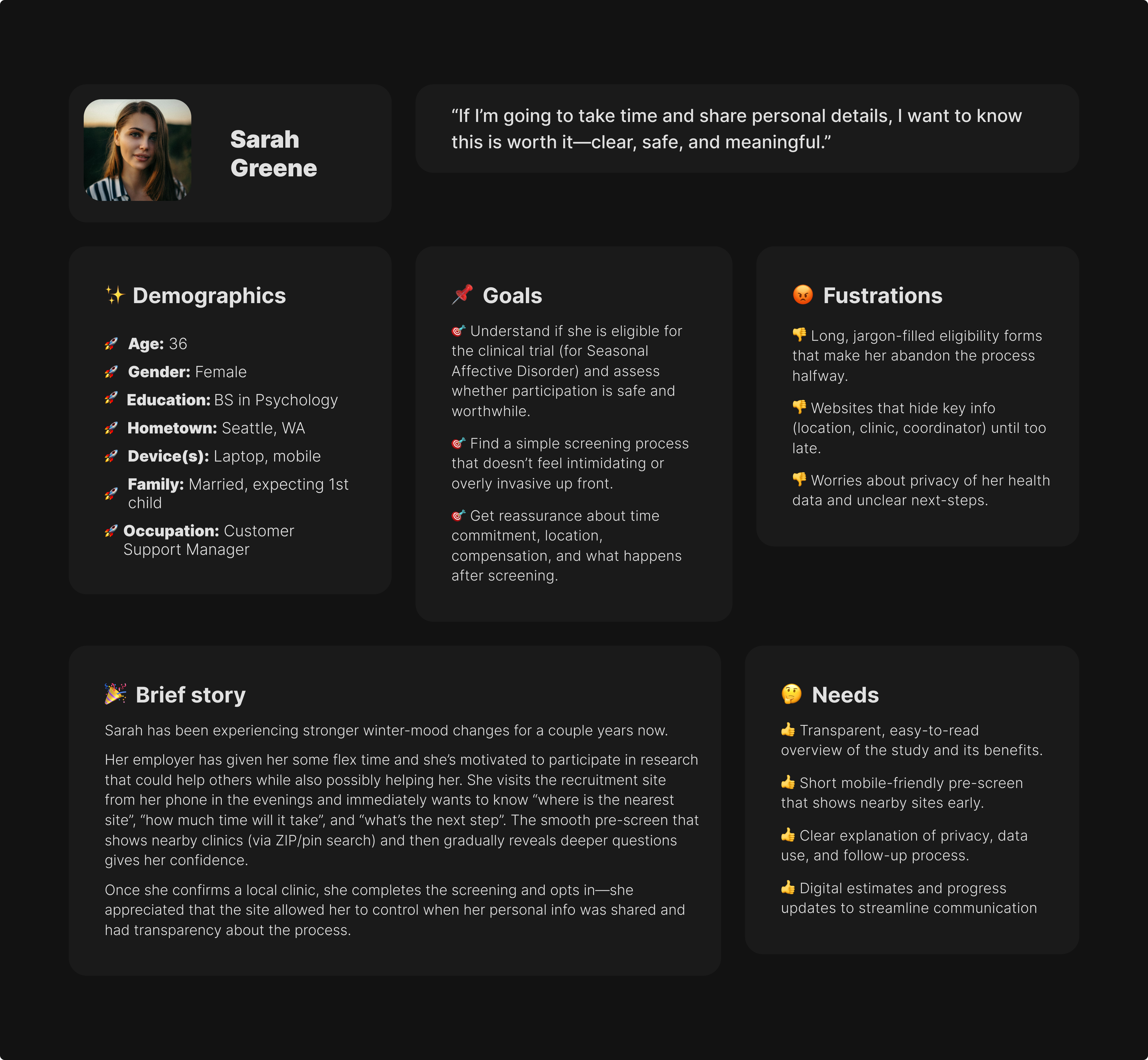
- Professional, science-backed copy with visible IRB approval & sponsor.
- Dedicated referral portal with printable materials.
- Clear patient-status notifications or contact person for updates.
- Concise eligibility summaries she can share with patients.

Progressive Disclosure & Validation
With location-first approved, I designed a three-step progressive flow:
- Test site city directory + trial overview
- Eligibility screener with dynamic logic
- Consent and facility matching based on ZIP code
The solution balanced transparency with operational protection: a searchable directory of test site cities displayed upfront—users could quickly scan "Atlanta, Boston, Chicago, Denver..." to gauge viability without exposing facilities to premature contact.
This answered "Is this near me?" without giving enough detail to bypass the screening process.
Only after completing the screener and qualifying would participants enter their home ZIP code. The system would then display specific facilities within 150 miles with contact information—at which point they'd already been vetted for eligibility, making any contact with facilities productive rather than burdensome.
The eligibility screener used branching logic built in React—certain answers would skip irrelevant questions or disqualify participants early. This reduced cognitive load and respected users' time, addressing one of the friction points.
Testing & Iteration
Reconnecting with the 8 users over Zoom for screen sharing with think-aloud narration, I found revealed three critical issues persisting across prior campaigns:
- Privacy anxiety: Four participants explicitly asked "Is this stored?" or hesitated before beginning the screener. The prototype didn't address data handling upfront, and that uncertainty created friction even with the improved funnel. I added a persistent HIPAA compliance banner at the top of every screener page with plain-language data policy: "Your answers are confidential and HIPAA-protected. We don't store your information until you consent."
- Progress confusion: Users couldn't estimate how much effort remained. The generic progress bar (1/3, 2/3, 3/3) didn't reduce anxiety. I switched to conversational phrasing: "Quick eligibility check" → "Understanding your situation" → "Almost there!" This shifted perception from "medical form" to "guided conversation."
- Mobile spacing issues: Touch targets on radio buttons were too small (32px), causing mis-taps and frustration on mobile where most traffic was occurring. I increased all interactive elements to 48px minimum with generous spacing between options.
After two rounds of iteration based on this feedback, average screener completion time dropped from 4:20 to 2:30—a 40% reduction. More importantly, participants described the experience as "simple," "clear," and "reassuring"—language that was noticeably absent from feedback on the previous template-based approach during stakeholder discussions.
The city directory tested particularly well. Participants could scan it in under 10 seconds to determine viability, and the lack of specific facility details didn't create frustration—users understood they'd get precise information after qualifying. One participant noted: "This is perfect—I can see if it's even worth my time without feeling like I'm being kept in the dark."
Engagement Metrics & Behavioral Validation
The location-first strategy outperformed the previous template significantly, validating that the funnel structure—not just execution quality—had been driving abandonment.
Form abandonment dropped 29% (from 65% baseline across four previous sites to 37%)—still not perfect, but a substantial improvement proving that location visibility reduced mid-screener bailouts. The remaining 37% abandoned for legitimate reasons (ineligibility, scheduling conflicts, decision to not participate) rather than uncertainty-driven frustration.
Key Engagement Metrics
- Bounce rate 18% lower than prior campaigns (62% → 44%)
- Average session duration 41% higher than industry average for clinical trial recruitment
- 67% of completions occurred on mobile—validating the mobile-first design approach and 48px touch targets
- Verified participant matches increased 23%—higher-quality leads because users self-selected based on location before screening
Hotjar heatmap data revealed behavioral validation: users spent significant time on the city directory (average 18 seconds scanning) before proceeding to the screener—exactly the quick viability check research had predicted users needed. They also spent 2x longer on the "Eligibility Confirmation" screen compared to earlier screens, reading privacy messaging and understanding next steps before consenting.
Participant Feedback
When surveyed during debriefing, 100% of users reported "easy" or "very easy" experience ratings. The most common feedback specifically cited the city directory and clarified privacy disclosure as standout improvements.
"I appreciated knowing cities upfront—I could see it was worth my time before sharing personal details," one participant was quoted as saying.
The 67% mobile completion rate exceeded initial estimates and highlighted something the previous template hadn't optimized for: recruitment ads and outreach were happening during commutes, lunch breaks, or evening browsing—moments when desktop access wasn't available. The mobile-first decision wasn't just good practice; it matched actual user context that the data now validated.
Critically, test sites reported no increase in premature contact or irrelevant inquiries—the city directory approach successfully balanced transparency with operational protection.
Operational Impact & Framework Adoption
Beyond engagement and workflow gains, the new digital platform produced measurable organizational impact — driving efficiency, data integrity, and long-term research value.
Operational Gains
- 18% reduction in manual verification time for recruitment teams—higher-quality submissions meant less data cleanup
- 27% increase in qualified participant inquiries, raising overall lead quality
- Fewer ineligible leads reaching coordinators, improving analyst throughput
- Two regional study sites met enrollment quotas 11 days early, attributed directly to higher conversion rates
- Zero increase in premature test site contact—the city directory approach protected facilities while improving transparency
The recruitment manager noted: "We're filling cohorts faster and with fewer errors." The shift from quantity-focused (drive more traffic) to quality-focused (improve conversion) paid off operationally.
The most significant validation: the client replaced their existing template with this approach. The design system and content model are now being repurposed across two additional studies, establishing this location-first framework as their new standard. This adoption proved the hypothesis that drove the redesign: the previous 65% abandonment wasn't execution failure—it was structural friction built into the template itself.
The platform handled over 10,000 active users monthly with zero performance issues, confirming the React-based screener architecture scaled appropriately.
Closing Thoughts
This project taught me that fresh perspective's real value isn't seeing what others missed—it's having permission to question foundational assumptions. The client brought us in specifically to test whether a different approach might perform better. The previous team had delivered professional, functional sites following industry best practices. But sometimes best practices metasticize into unexamined convention and take outside eyes to question whether the convention still serves its intended goal.
The research made the case. Once I could show that every participant in testing went searching for location information before engaging with the screener—and that this behavior matched the support emails asking "Where is this trial?"—the stakeholder conversation shifted. It wasn't about the previous sites being poorly executed; it was about testing whether a fundamentally different funnel structure could perform better. The 29% reduction in task abandonment validated that hypothesis.
The operational concern about test sites being bombarded with questions was legitimate and needed addressing. The breakthrough was realizing you could show test site cities without exposing facility contact details—solving for participant uncertainty while maintaining operational protection. Cities gave users enough information to gauge viability ("Is there a site within reasonable distance?") without giving them enough to bypass the screening process. That both-and solution only emerged from treating the operational constraint as a design challenge rather than a reason to hide information entirely.
If I could redo anything, I'd push for A/B testing the location placement even though the timeline was tight. We had strong qualitative evidence supporting location-first and the client approved it, but I'd love quantitative validation showing exactly how much conversion improved versus the previous template in a controlled test. The 65% → 37% comparison is compelling, but it compares different campaigns, timelines, and potentially different traffic sources. Direct A/B data would have been definitive.
The framework adoption across two additional studies was the real win—not just a successful project delivery, but changing institutional practice. That's what validated bringing in a fresh perspective: different approach produced measurably better outcomes that the organization now uses as standard.
Most significantly, this project provded that challenging established patterns requires research scaffolding to survive scrutiny. I couldn't have questioned the template structure without competitive analysis proving the pattern was universal and interviews showing users actively sought location information. Strategic design decisions need evidence, especially when you're proposing something different than established convention.