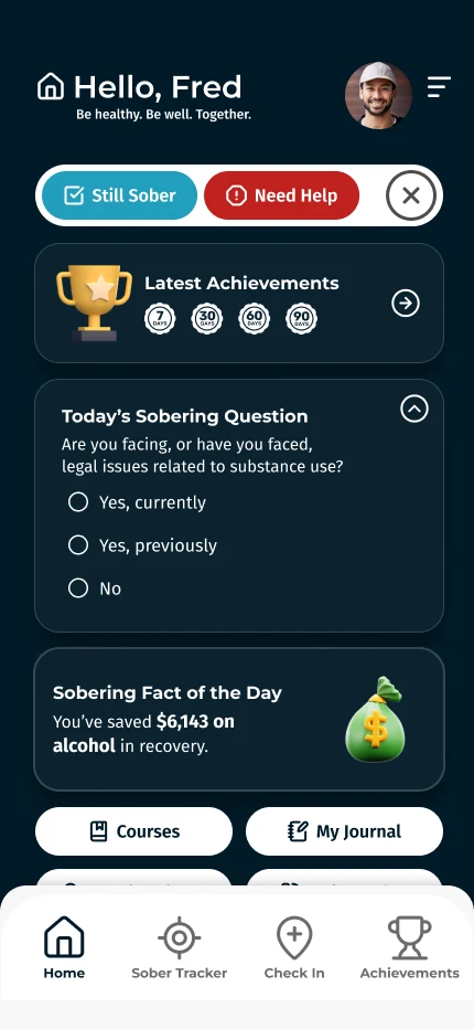

Support, not surveillance
Never Alone Recovery supports people living with mental health conditions and substance use disorders. They wanted an app where people could find nearby support meetings, track their recovery, and journal, with room to add sponsor linking and 24/7 chat later. The hard part wasn’t the features. It was making daily check-ins feel like support, not surveillance, especially for people already getting more than enough of the latter.
Three decisions behind it
Status, not scores
The original idea behind the Sobriety Tracker was to distill someone’s risk of relapse into a numerical score. In pilot interviews, journals, and surveys, people said it felt like being kicked when they’re down. I replaced the score with three status words: Stable, Cautious, and At Risk. The trade-off was precision: a word can’t show small day-to-day changes the way a number can.
Progress people can feel
“90 days sober” is an abstract milestone. “You’ve saved $___ on alcohol since March” is something tangible. The app pairs each person’s milestones with self-reported data (or national spending averages by default) to estimate concrete wins.
A meeting finder by location
A GPS-powered meeting finder shows nearby support groups, because the easiest meeting to get to is the one most likely to be attended. Phase 2 was planned around a pitch to state and local governments: a way to digitally document court-ordered meeting attendance. Location data tied to recovery is about as sensitive as data gets, and that feature would have needed careful consent and data limits. In the end, the funding never came through, and interested partners moved on before Phase 1 reached soft launch.
What didn’t work
Between the pilot feedback and one-to-one usability sessions with NAR’s community volunteers, the same thing kept happening: people scrolled up and down, unsure where to go next. My fix was a persistent dock at the bottom with one-tap access to the three core features (Sobriety Tracker, Meeting Finder, and Achievements) plus the dashboard. In testing after the change, more than 77% of first clicks from the dashboard went to one of the three other dock tabs.
Results
| 46% at day 120 | 77%+ | “Gentle” |
|---|---|---|
| Of a 35-person pilot, with no incentives offered | Of first clicks from the dashboard went to a core feature | How NAR’s long-term community members described it |
Pilot participants came through the nonprofit, so this isn’t app-store retention, but four months is a long time for anyone to keep opening a recovery app that isn’t working for them. The app launched on both Android and iOS, but development was paused shortly after when the nonprofit’s subsidy funding changed.
Takeaways
I now test navigation much earlier in the process. People scrolling around unsure where to go is a problem a five-person test would have caught months sooner.